See any site's desktop & mobile layout at once
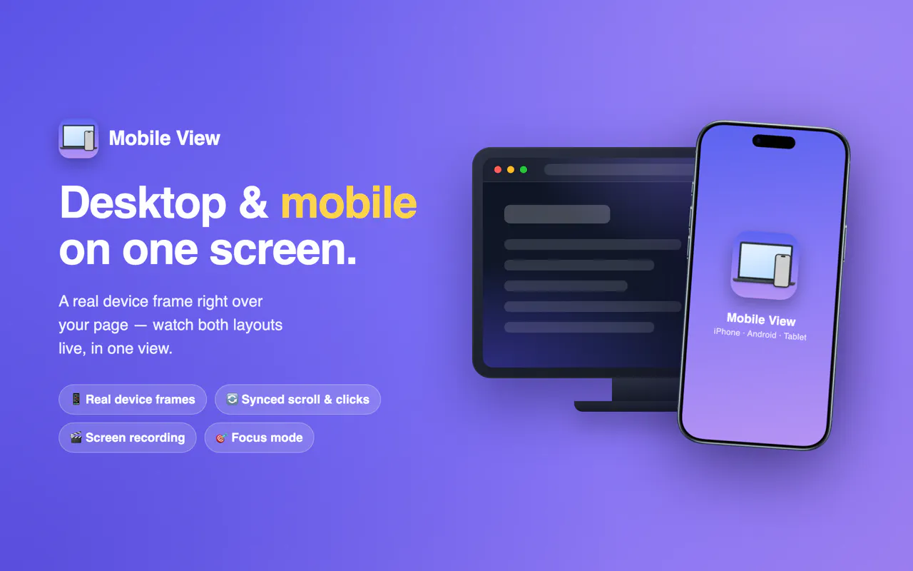
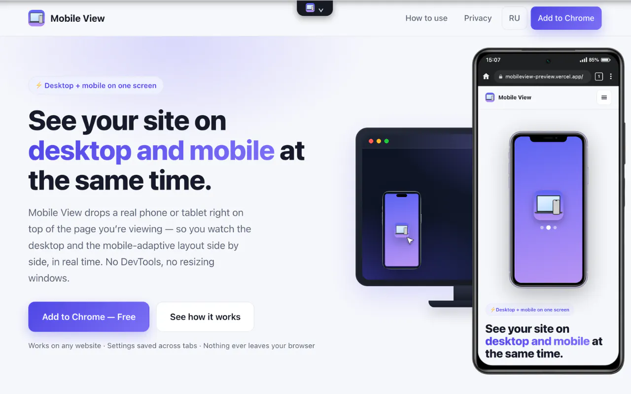
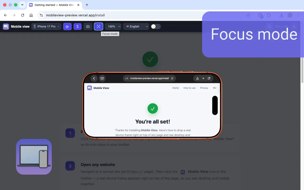
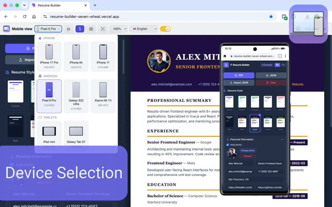
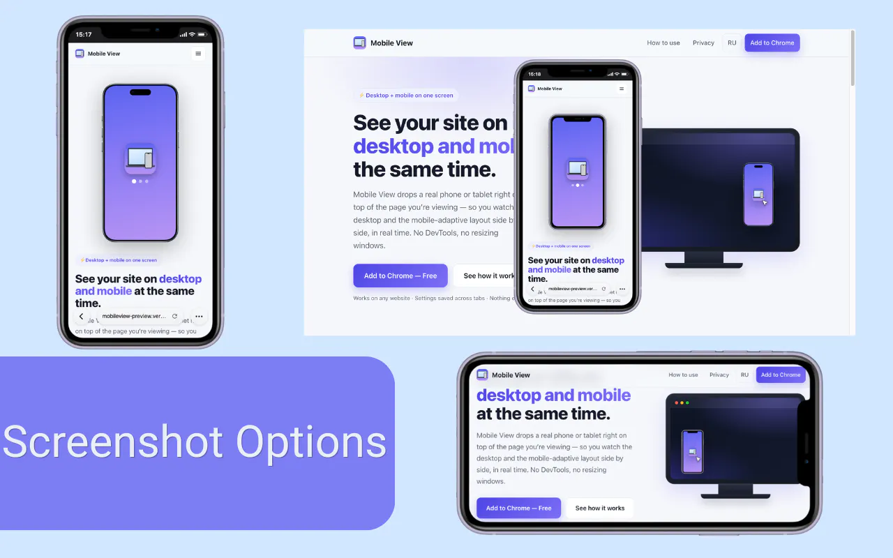
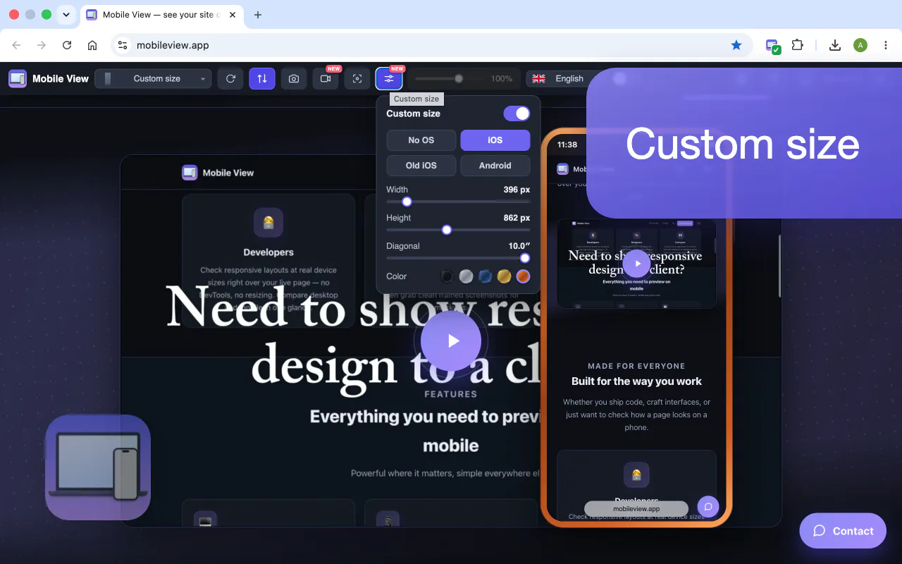
Mobile View overlays a real phone or tablet frame right on top of any live website, so you see the desktop and mobile layouts at the same time — no DevTools, no separate device. Scrolling, clicks and typing stay in sync across both. Switch devices, rotate, set custom sizes and zoom, change theme and language. Take screenshots or record the screen (WebM), use focus mode, and more. Works on any responsive site. Free, no account, runs fully locally in your browser.
아직 댓글이 없어요. 가장 먼저 남겨보세요!
Mobile View에 대한 X의 실제 대화
X에 게시